One visual language for the whole season
Fans and sponsors should recognise your post before they read your name. That comes from consistency: the same typography, colours and layout from the first race week post of the season to the last result.
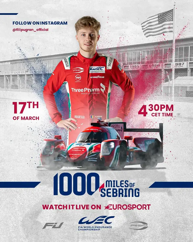
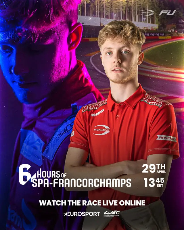
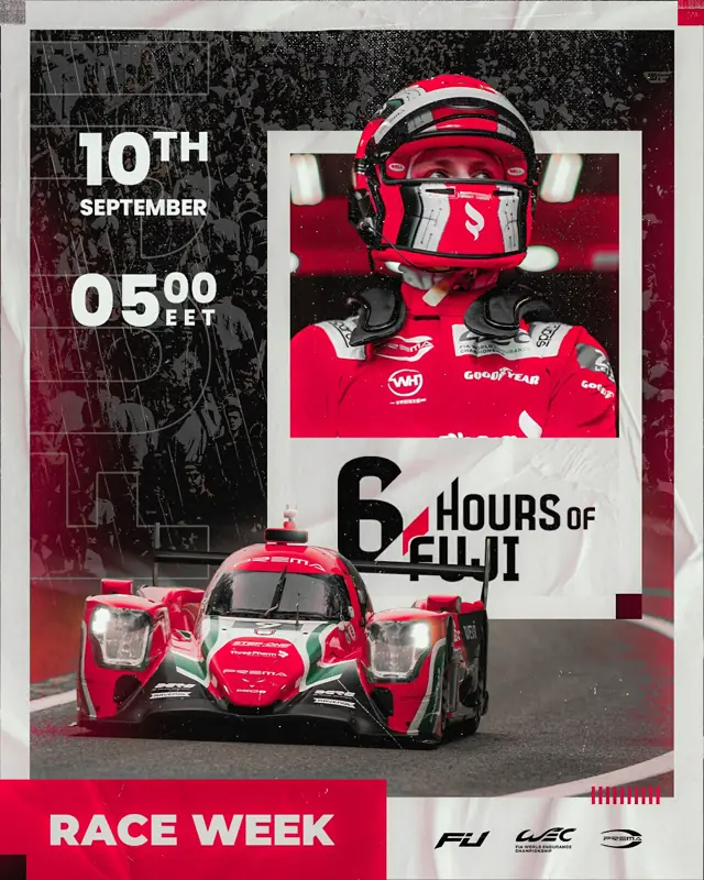
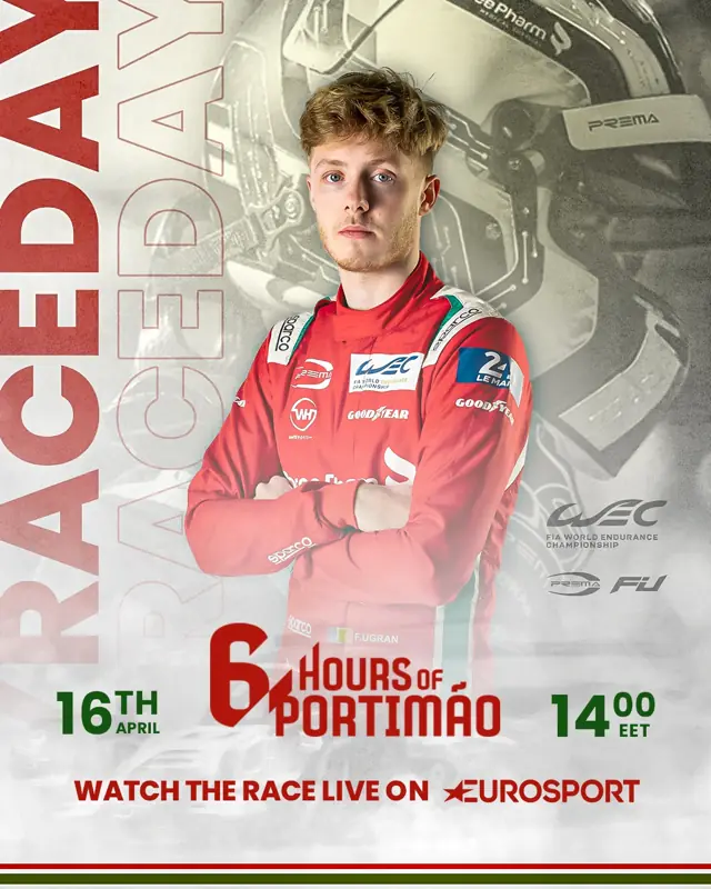
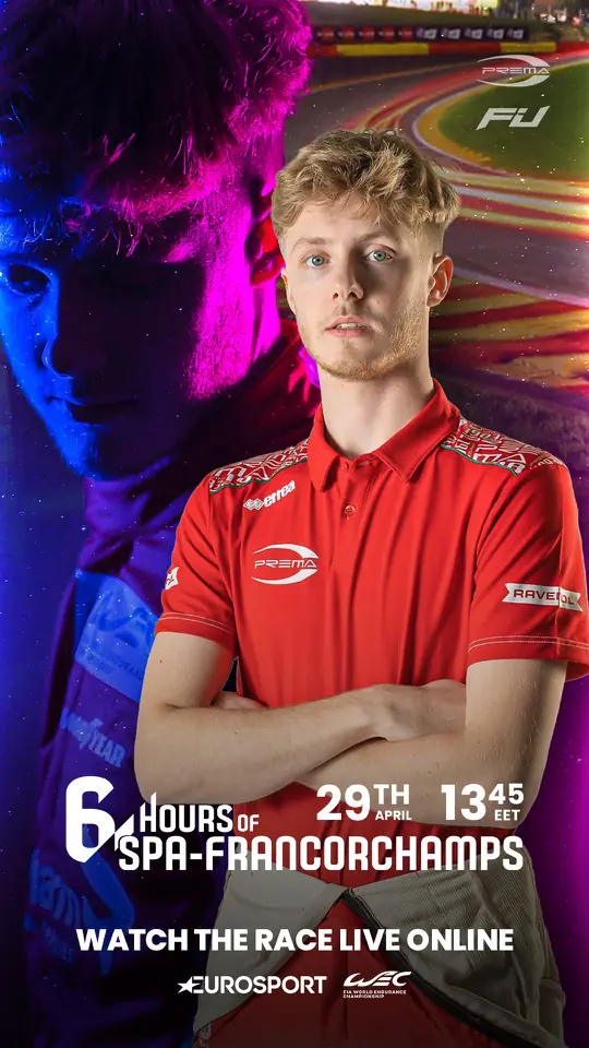
The same system across Filip Ugran’s 2023 WEC season.
Designed for the speed of a race weekend
A result posted the next morning is old news. Motorsport graphic design has to be ready before the result exists: templates for each type of post, and result stories prepared in a version for every possible position, so the driver posts the moment the session ends.
The right formats
Most race weekend content lives in two shapes: the portrait feed post (4:5), which stays on your profile, and the full-screen story (9:16), which carries the live moments. Plan every graphic for the format it will be seen in, and keep the important text away from the edges where the app’s buttons sit.
Readable on a phone, in a second
People scroll past in a second. One message per graphic, the position or the circuit in large type, and nothing that needs zooming. If a sponsor’s logo has to be visible, give it a fixed place in the layout instead of squeezing it in at the end.
What to send your designer
Your logos and your partners’ logos, in the best quality you have.
Photos you have the rights to use: the car on track, portraits, the paddock.
Car number, team and series, spelled the way they appear officially.
The season calendar and each weekend’s timetable as soon as it is published.
Graphics and website together
The graphics carry the weekend; the website carries the season. When both come from the same visual language, a sponsor who clicks from your post to your site sees the same driver.